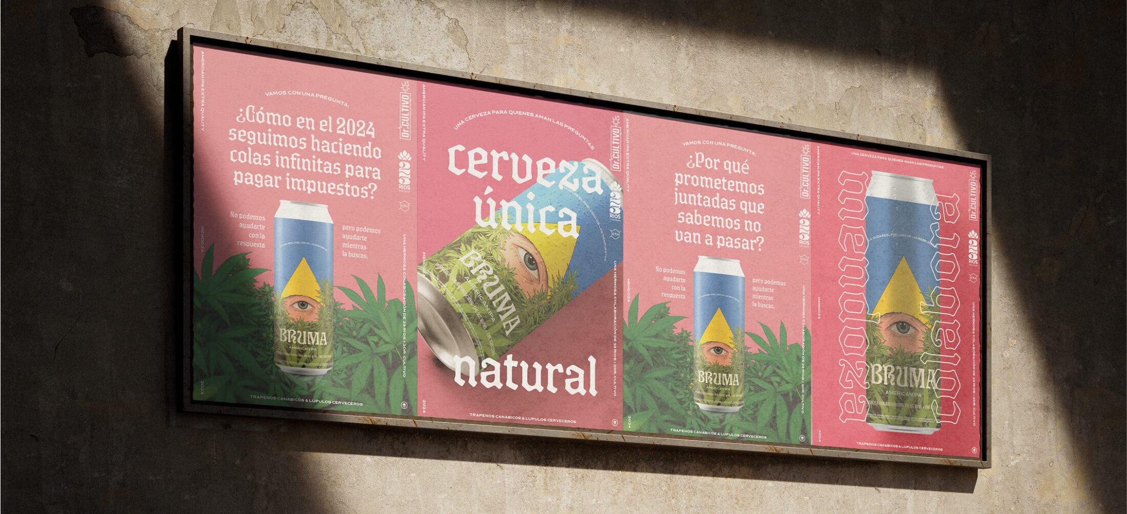
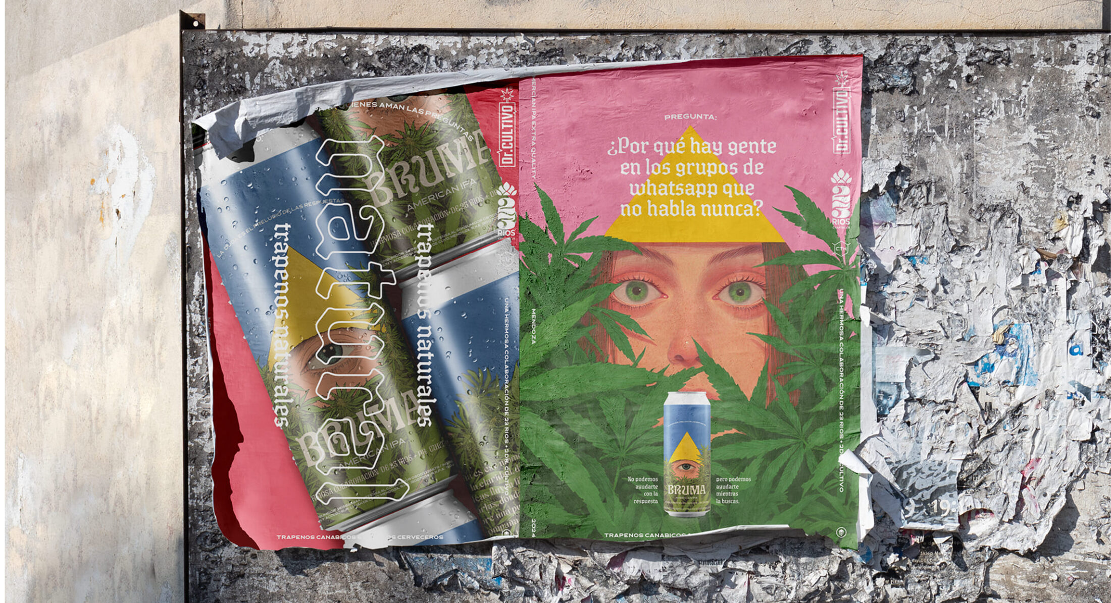
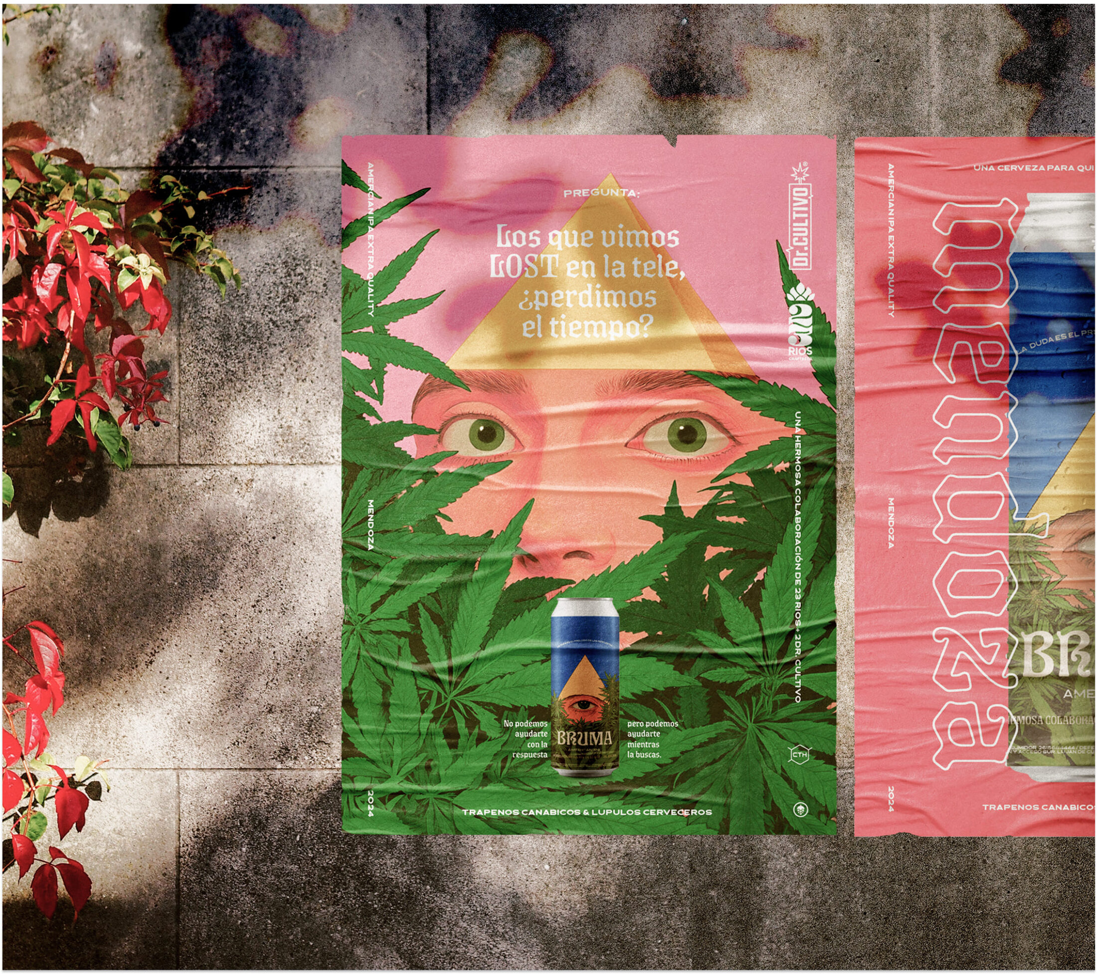
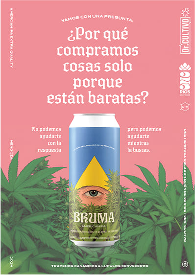
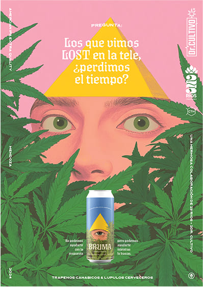
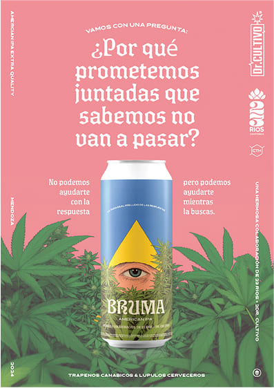
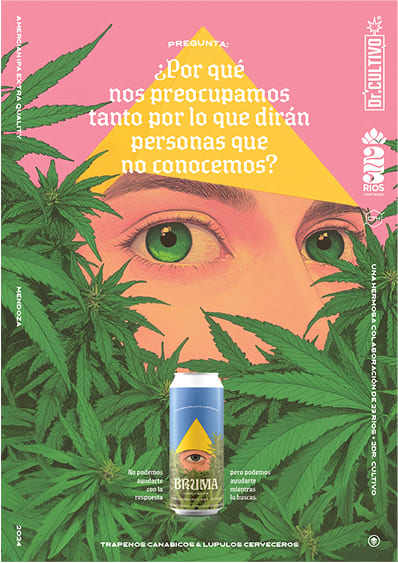
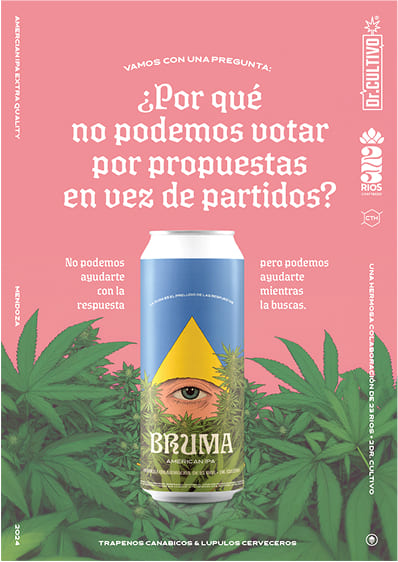
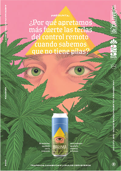
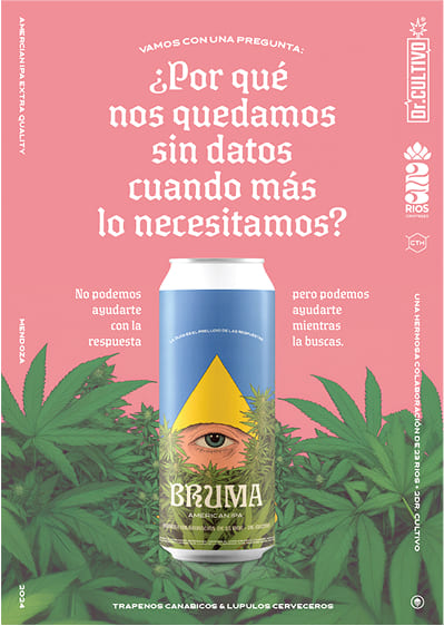
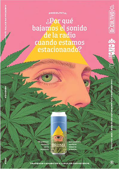
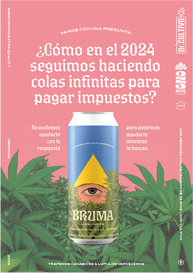
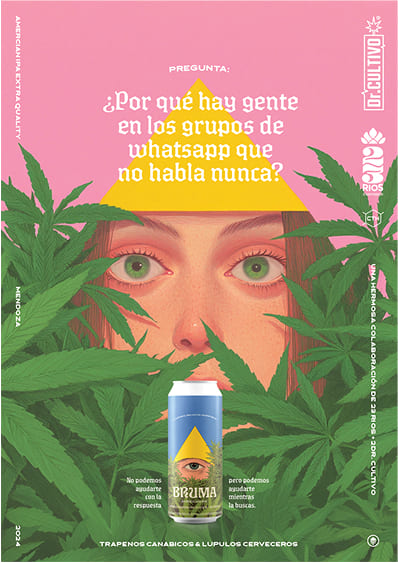
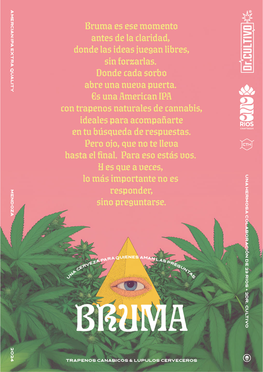
Bruma is the result of a unique collaboration between 23 Ríos, Dr. Cultivo, CHC, and Felicidad, standing out as the first beer in Latin America—and one of the few worldwide—to incorporate natural terpenes in its brewing process. At Felicidad, we developed a concept that transcends the beer itself, evoking a state of introspection and exploration. We created the name and designed a visual identity inspired by the “mist” of thought, a space where ideas and questions flow without the need for immediate answers.
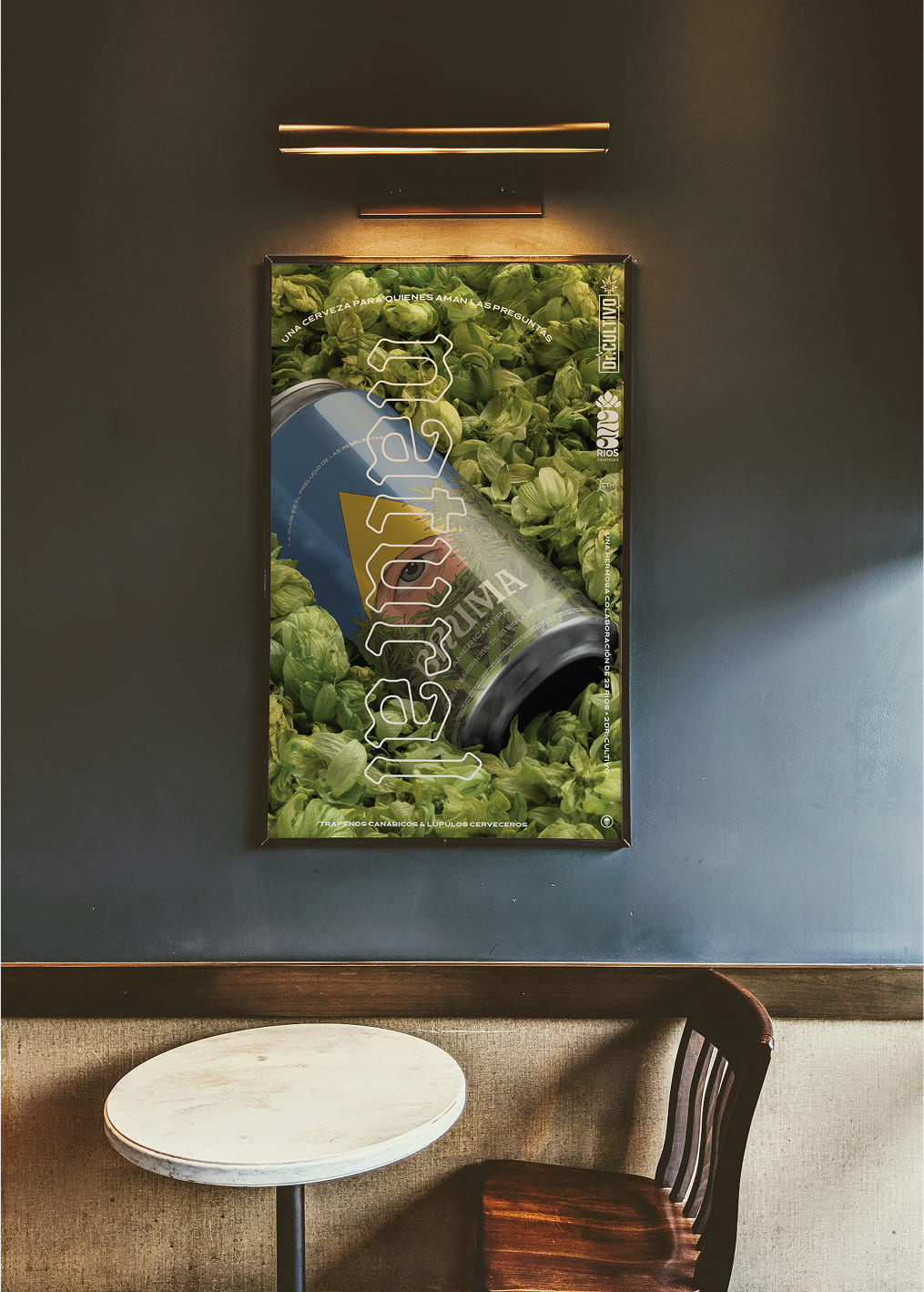
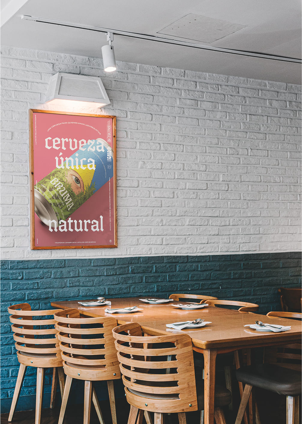
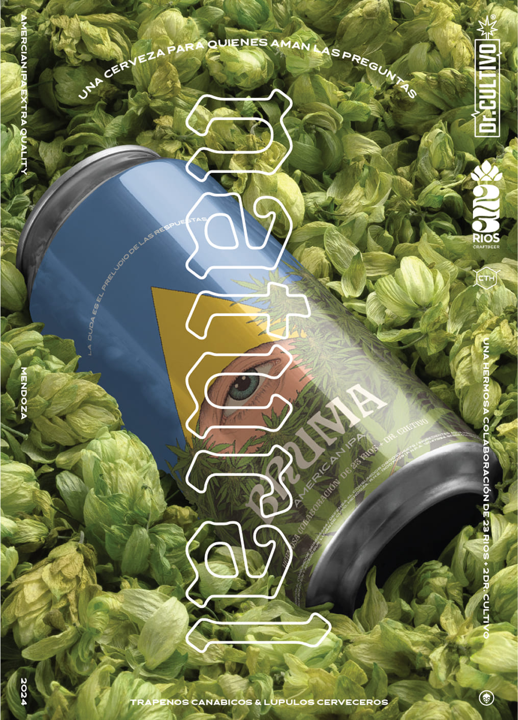
The Bruma can invites discovery and experimentation, highlighting the purity of its natural process and the innovative use of cannabis-derived terpenes. Our social media campaign reinforces this narrative, sparking intrigue and conversations that position Mendoza as a pioneer in craft beer innovation.
Bruma celebrates that “mental mist” that arises when enjoying a good beer or connecting with cannabis—a moment where questions take center stage and certainties fade. With Bruma, we aimed to highlight the value of curiosity and exploration, inviting people to reflect and discover new perspectives. It’s a beer crafted for those who love to think, ponder, and question, because we believe that in that space of curiosity and wonder, the real journey begins.
The Concept
To meet the multifaceted communication demands of the festival, we employed a sophisticated typographic grid, providing us with the versatility to integrate various graphical elements seamlessly—be it photographs, illustrations, collages, or 3D renderings.
This cohesive framework ensures that all communication materials maintain a consistent visual identity across the three distinct stages of the event, without compromising individuality. Moreover, its adaptability allows for seamless integration across diverse mediums—from merchandise and outdoor advertising to social media stories and email signatures.
The Art Direction
In the art direction of the campaign, the visuals reflect a simple yet impactful approach designed to resonate with audiences in specific sectors: Pharma, Food, and Viticulture. Each illustration employs a minimalist color palette, with clean lines and stylized shapes that capture the essence of each industry in a clear and accessible manner. This style aims to emphasize the simplicity and efficiency Moondesk brings to managing crucial files without overwhelming the visual message.
Elements are carefully chosen to universally represent the importance of each sector, avoiding details that could narrow interpretation. Recognizable icons—such as bottles for the viticulture sector or laboratory symbols for Pharma—provide instant clarity. Additionally, the use of soft lines and warm tones adds a human touch, aligning with the goal of connecting with users through a modern and approachable visual aesthetic.
The Moondesk campaign assets performed exceptionally well on social media, thanks to the visual material’s flexibility, which adapted dynamically to animated formats. The graphic elements and illustration style allowed for engaging and fluid content that captured Moondesk’s essence, generating greater reach and engagement. The animation emphasized the “unmissable files” narrative, effectively highlighting the importance of efficient and sustainable file management in a visually impactful way.