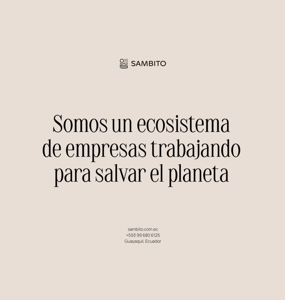
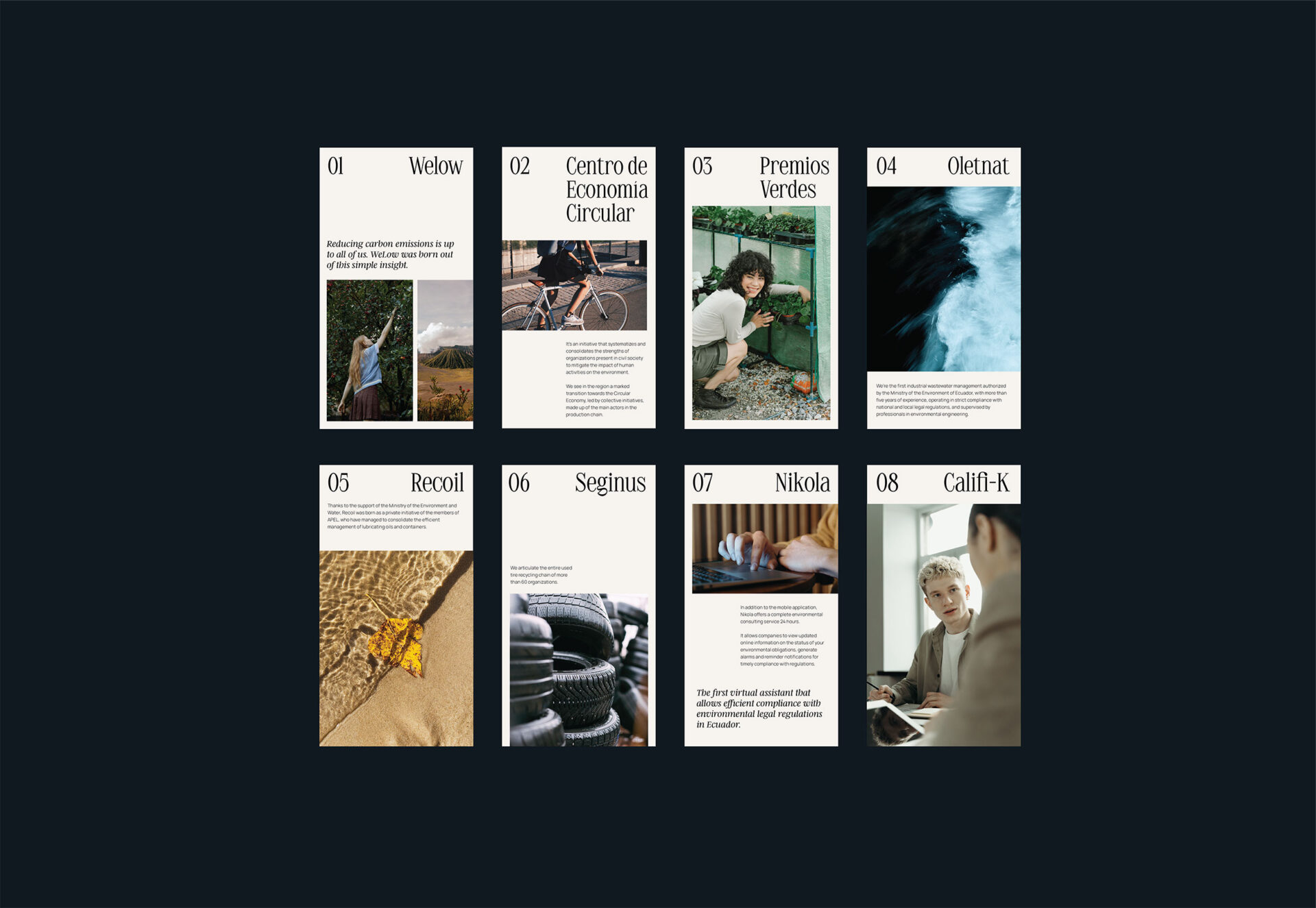
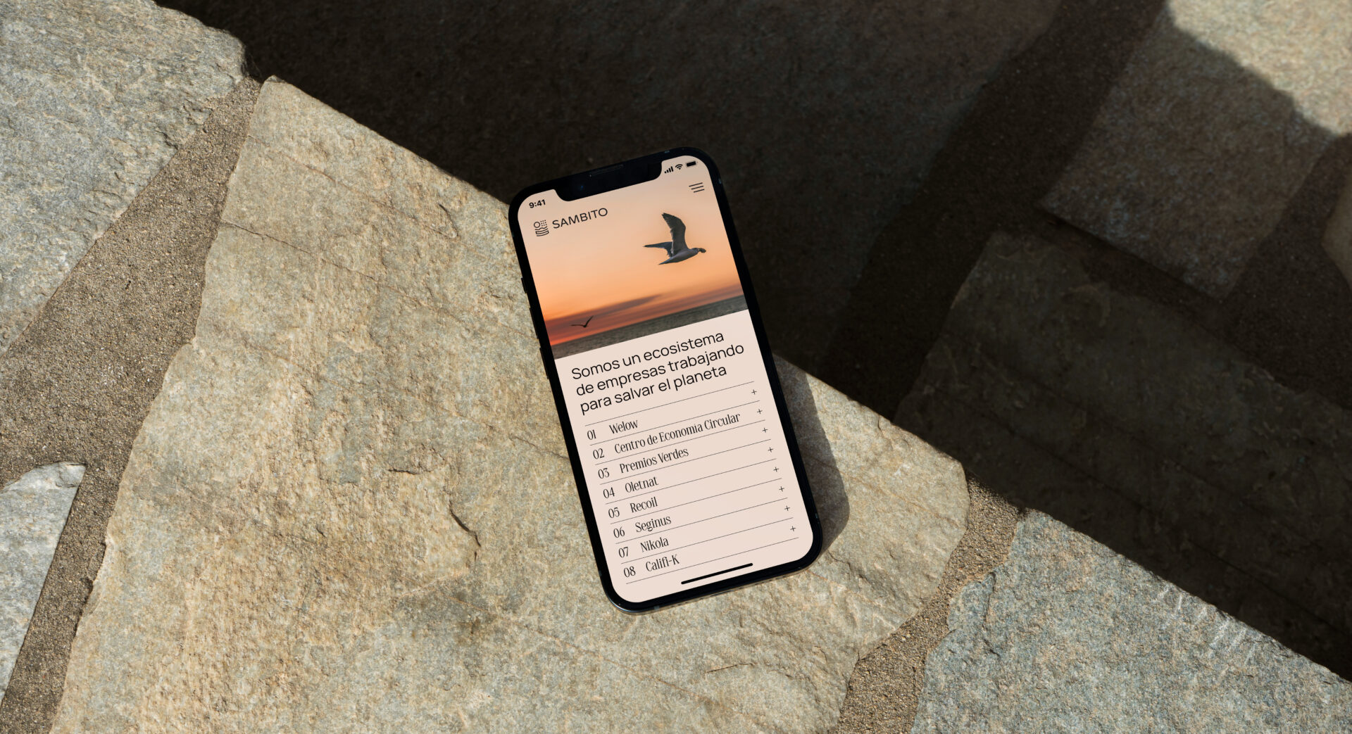
Sambito is a company that operates in a wide range of areas through multiple business units. Each one is dedicated to solving different aspects of today’s sustainability challenge.
Being a company that’s been working for more than 20 years in the sector, the goal was to better reflect its values and its actual position in the market through this rebranding. We wanted to maintain the existing concept behind the visual brand which wisely supported all their branches but make it look relevant and innovative.
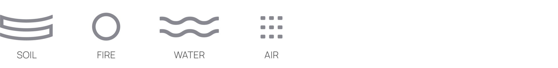
Elements
Sambito’s prior brand pictured the elements of soil, sunlight, water, and air that make life on Earth possible. We decided to maintain these elements, as they encompass the variety of services offered by the brand through its numerous units, but to work on a more simplified, pregnant, universal symbol.
We were interested in making the elements relate to each other more organically, using a composition that’s similar to what our natural environment looks like.
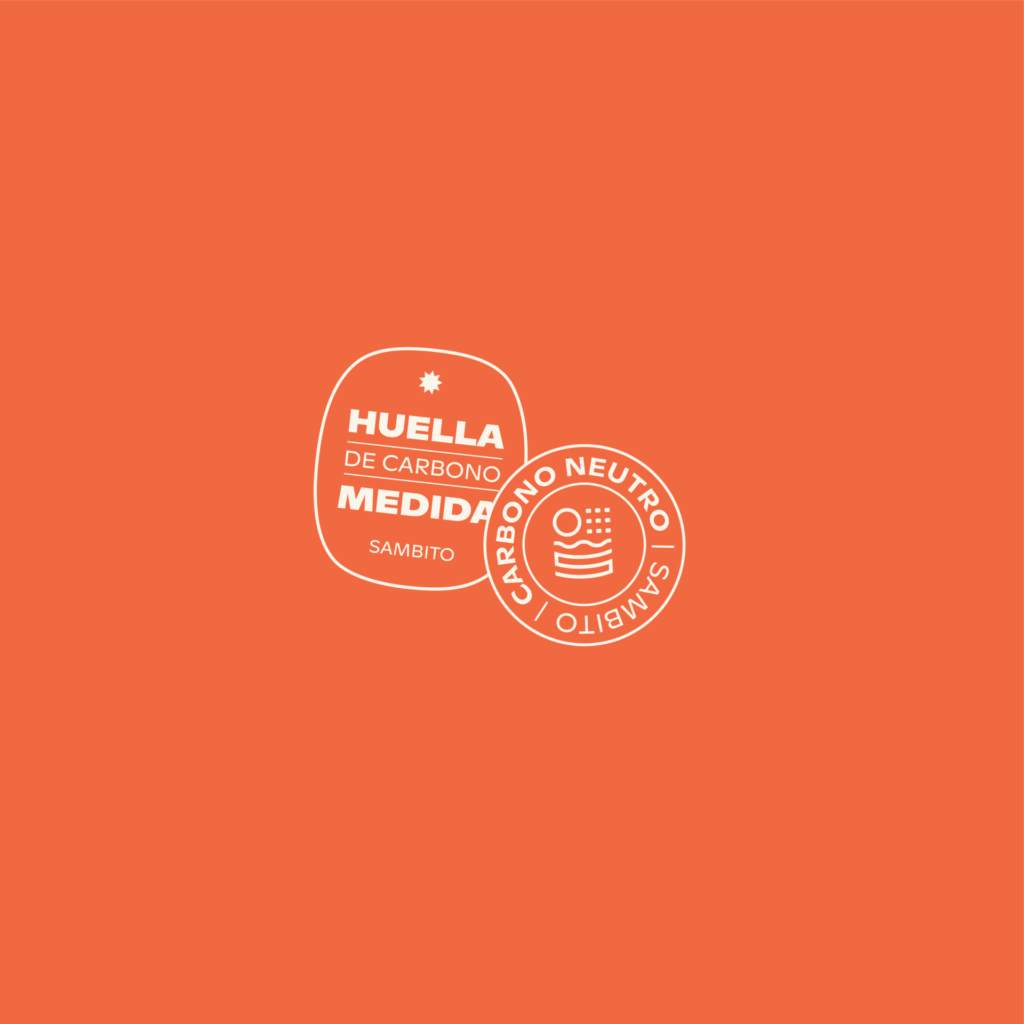
Colors
In sustainability-oriented enterprises, identity colors often involve greens and blues. Sambito followed this path, but we wanted to change that using a less seen tone to bring more colors into the conversation, as green has already bored and been literally “greenwashed.”
We came up with a palette that continues with the isotype logic but made the main brand color a joyful orange.