- Campaign
- Copywriting
- Art Direction
- AI Illustration
- Creative Direction
- Content
- Sustainable Narrative
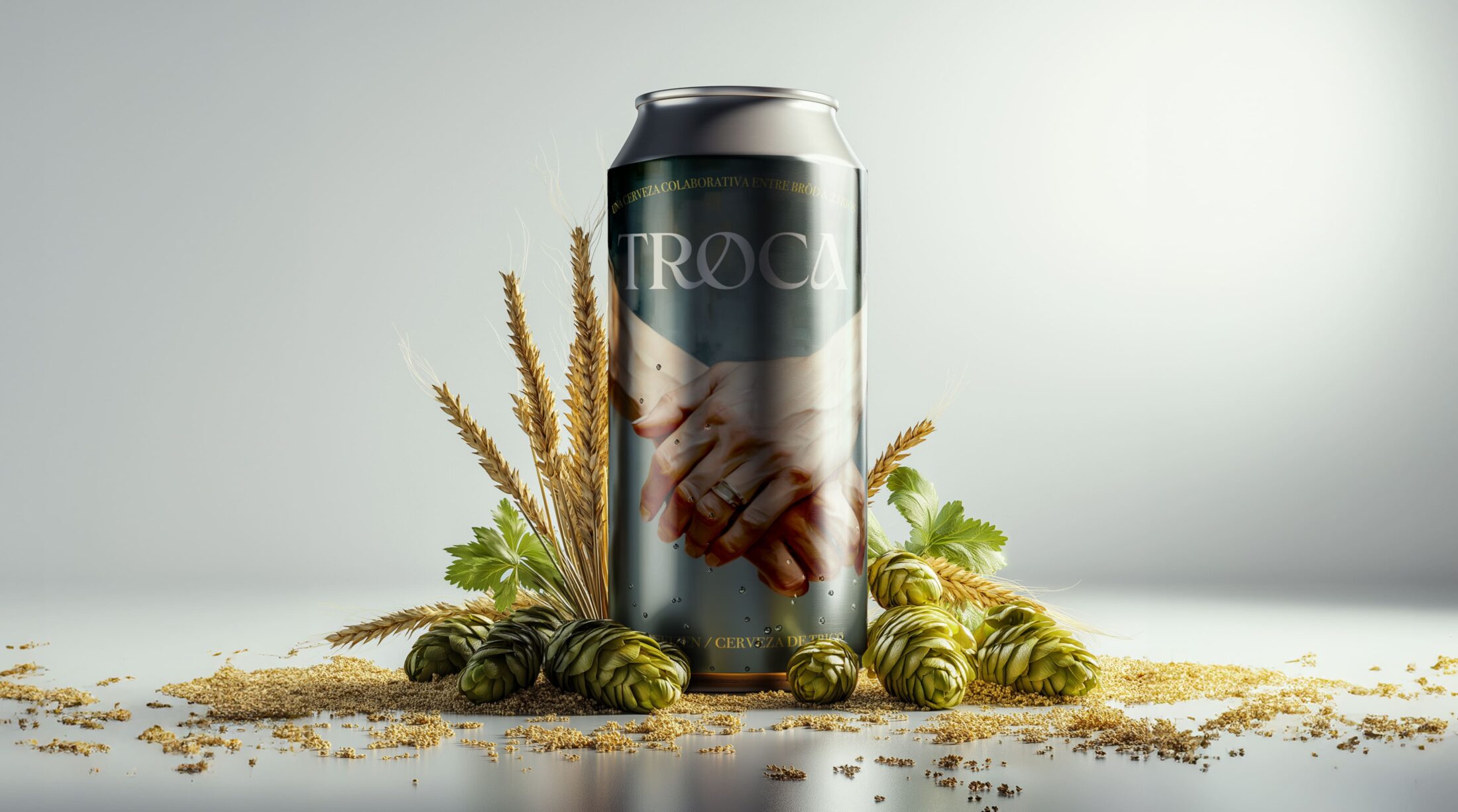
Troca is a testament to the value of local craftsmanship, entrepreneurship, and innovation. Created through a collaboration between two Mendoza-based companies, 23 Ríos and Bröd, this limited-edition beer highlights the power of local partnerships to deliver exceptional quality and flavor. The purpose of Troca is simple yet profound: to celebrate and elevate the work of local businesses, showcasing the incredible potential of Mendoza’s talent and creativity.
By joining forces, 23 Ríos and Bröd have crafted a product that represents their shared commitment to excellence, innovation, and collaboration. This beer isn’t just about taste—it’s about championing local enterprise and demonstrating how working together can lead to extraordinary results. With Troca, both companies reaffirm their dedication to creating world-class products rooted in local expertise and tradition, proving that Mendoza is a hub of craftsmanship and creativity.
- A Unique Blend of Flavour and Philosophy
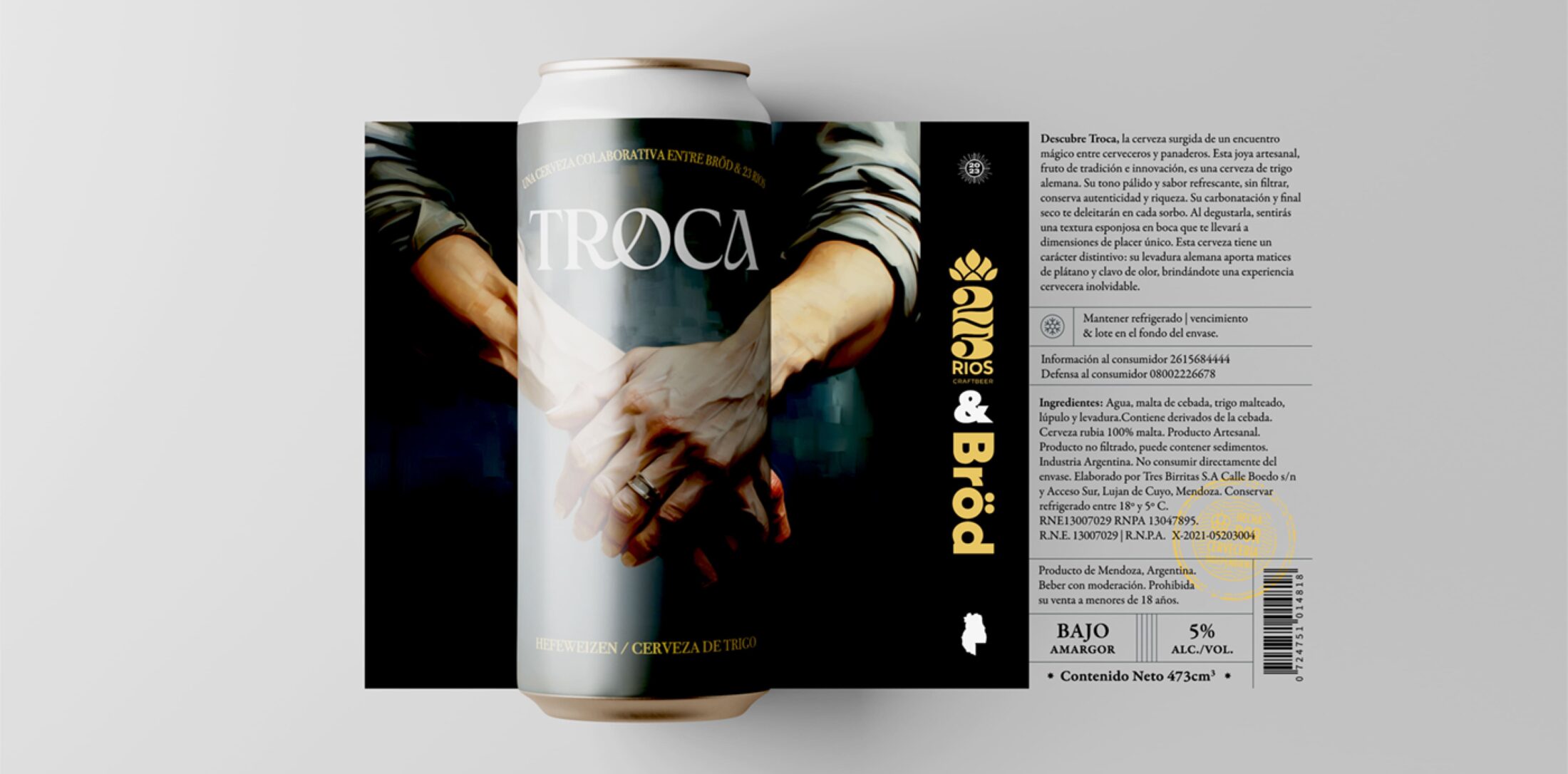
Troca is not just about the message; it’s also about delivering a premium beer experience. Crafted by the talented teams at 23 Ríos and Bröd, this beer is the product of true craftsmanship, blending the expertise of a master baker and a master brewer. The result is a flavor profile that balances rich malts with vibrant hops, creating a drink that is both approachable and memorable.
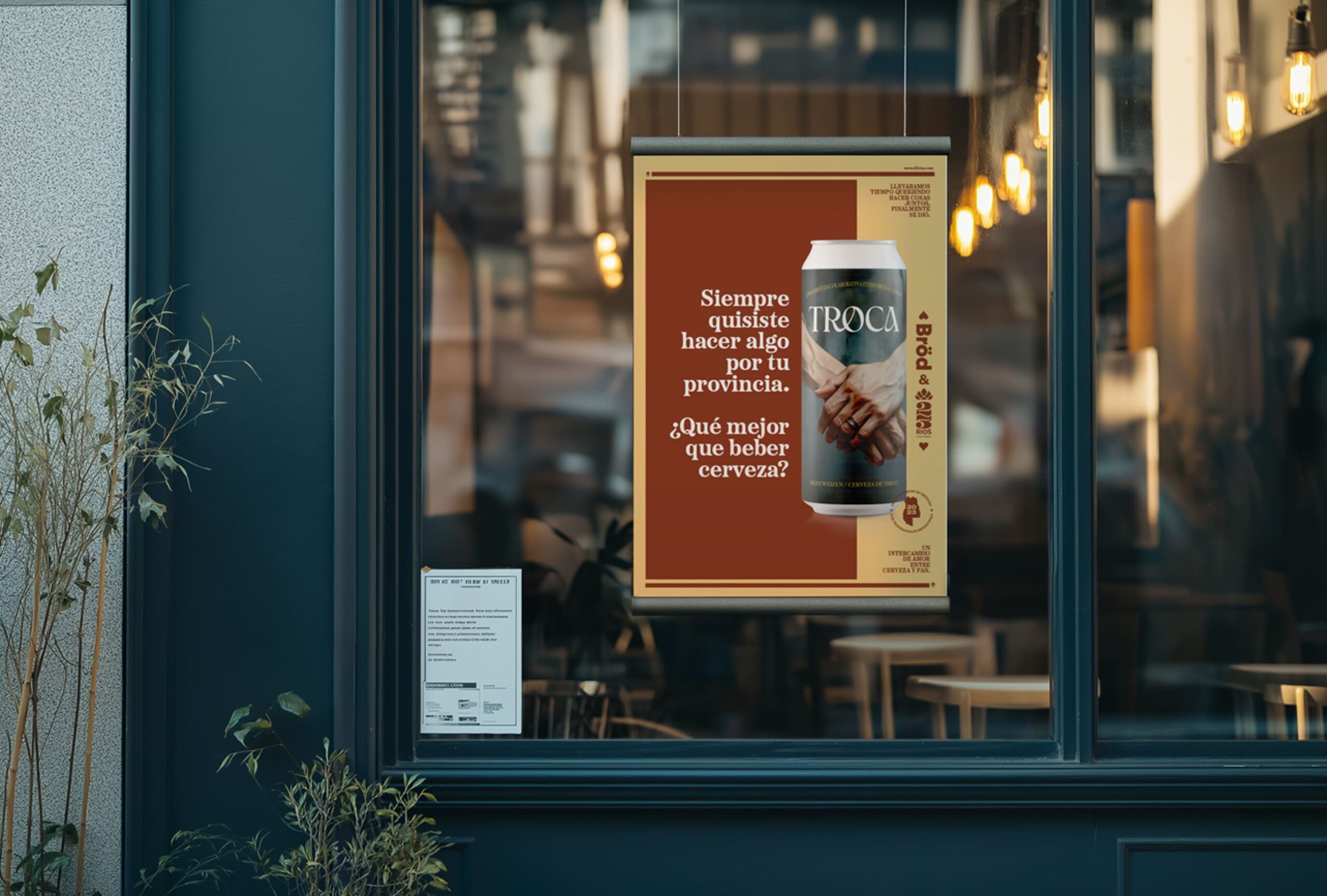
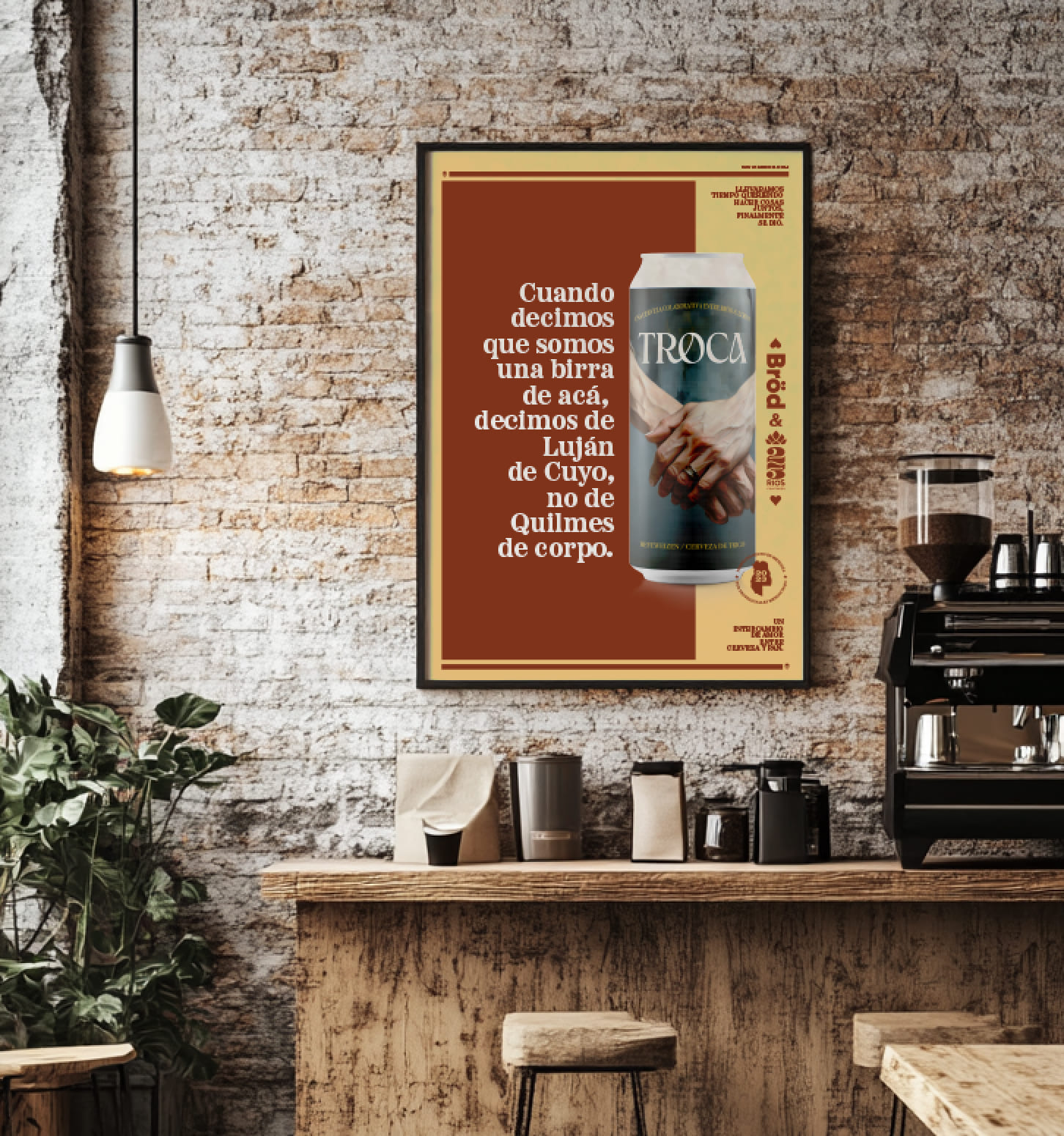
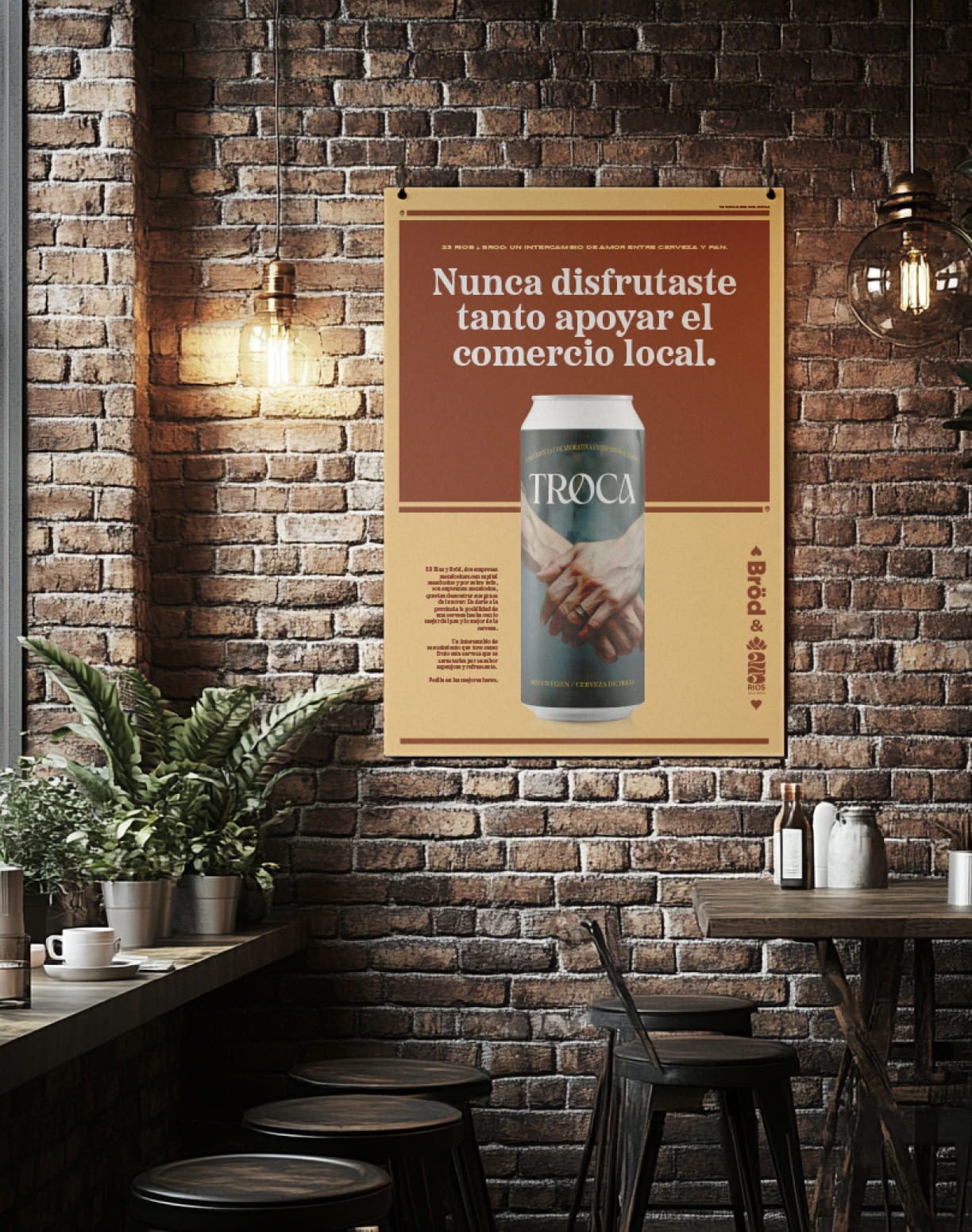
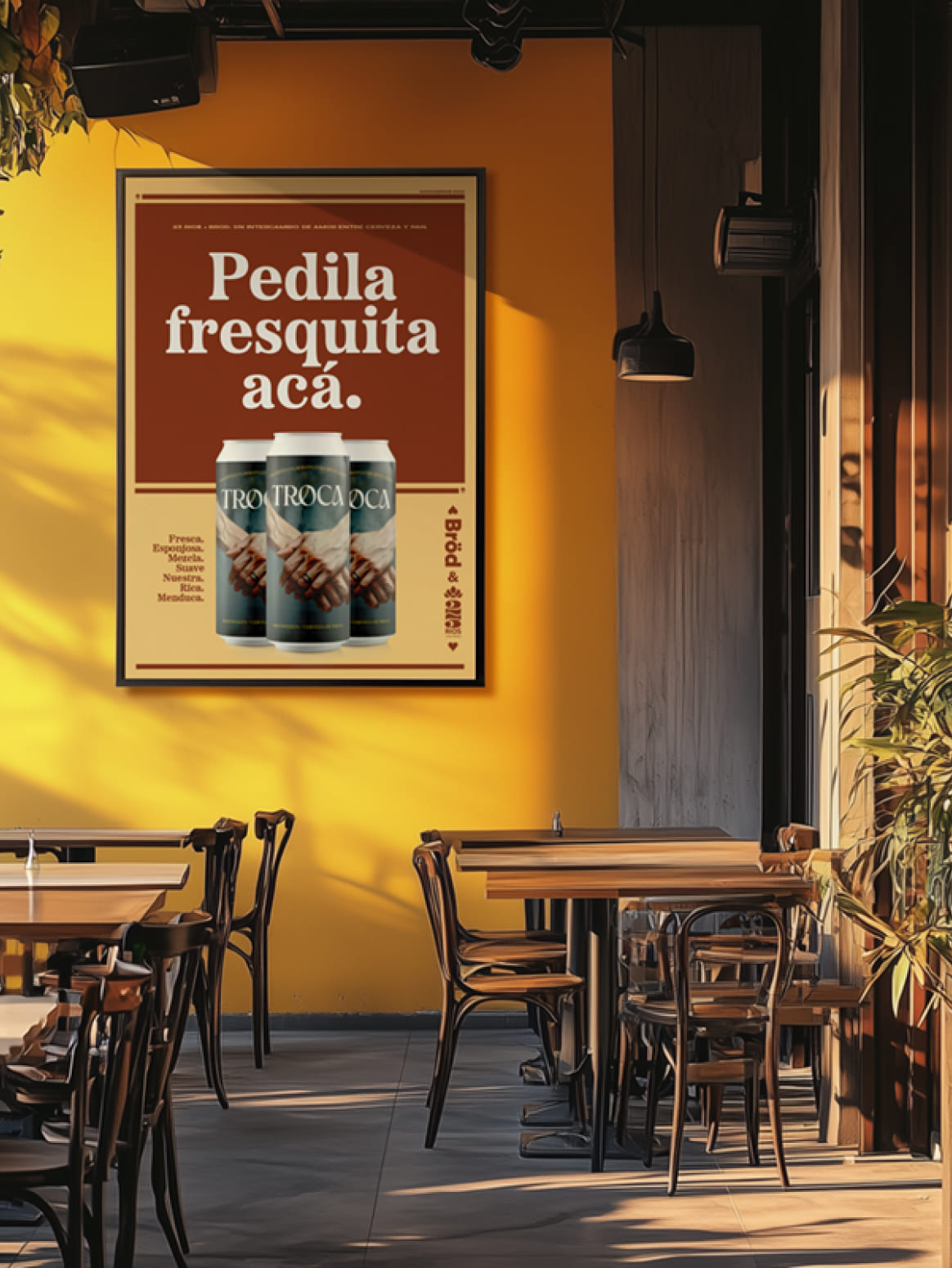
The design of the can tells its own story of collaboration and connection. Featuring an original acrylic painting of two hands—one masculine and one feminine—intertwined to symbolize unity, the artwork reflects the spirit of Troca: something created together, with purpose and care. This powerful imagery celebrates the idea that meaningful creations come from working hand in hand, just as this beer does. By blending artistry with craftsmanship, the design emphasizes that Troca is more than a product—it’s a celebration of collaboration, creativity, and shared effort.


- The identity
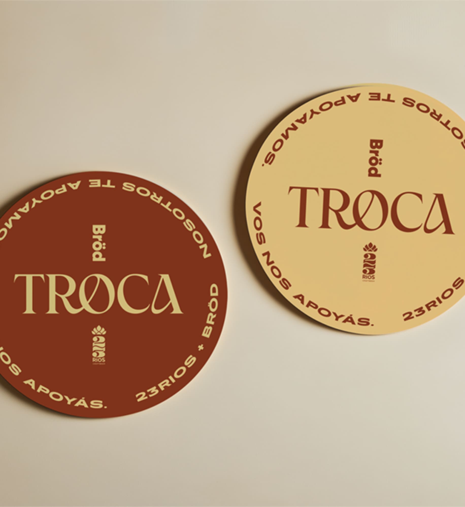
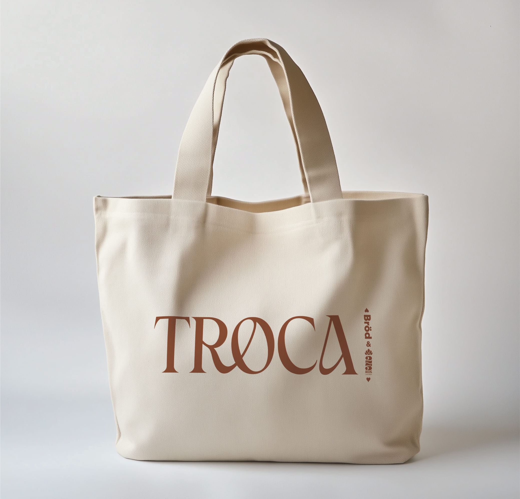
The Troca logo captures the essence of collaboration and unity, with a design that speaks volumes about the partnership behind the beer. The subtle intertwining of the R and O is a masterful detail, symbolizing the seamless connection between 23 Ríos and Bröd. This elegant interplay reflects the collaborative spirit that defines Troca, emphasizing how two distinct entities can come together to create something unique and greater than the sum of their parts. The flowing design of these letters visually narrates the idea of working hand in hand, perfectly encapsulating the beer’s story of local craftsmanship and shared purpose.

- The narrative
The narrative of the Troca campaign centers on a beautiful representation of collaboration and love, inspired by the symbolic connection between the baker and the brewmaster—a man and a woman—whose partnership reflects the union of craft and passion. This metaphor of affection and teamwork is woven into the story of the beer itself, as their shared expertise and creativity “kiss” to create a product that celebrates the best of local talent. Through this storytelling, Troca becomes more than a beer; it becomes a tribute to the love for craft, for Mendoza, and for the spirit of working together.

